
Color is one of the most powerful tools in branding. It speaks before words do, shapes first impressions, and even influences decisions. Every color carries meaning, evokes emotions, and sets expectations. In branding, using the right colors can strengthen your identity, build trust, and create a lasting connection with your audience.
Why Color Matters in Branding
Studies show that up to 90% of snap judgments about products are based on color alone. It’s not just about aesthetics—it’s about psychology. The colors you choose for your brand influence how people feel about it and whether they engage with it.
Think of iconic brands like Coca-Cola, Facebook, and McDonald’s. Their colors are instantly recognizable, and they reinforce their brand’s personality at a glance. Choosing the right color palette isn’t just a design decision—it’s a strategic one.
What Different Colors Say About Your Brand
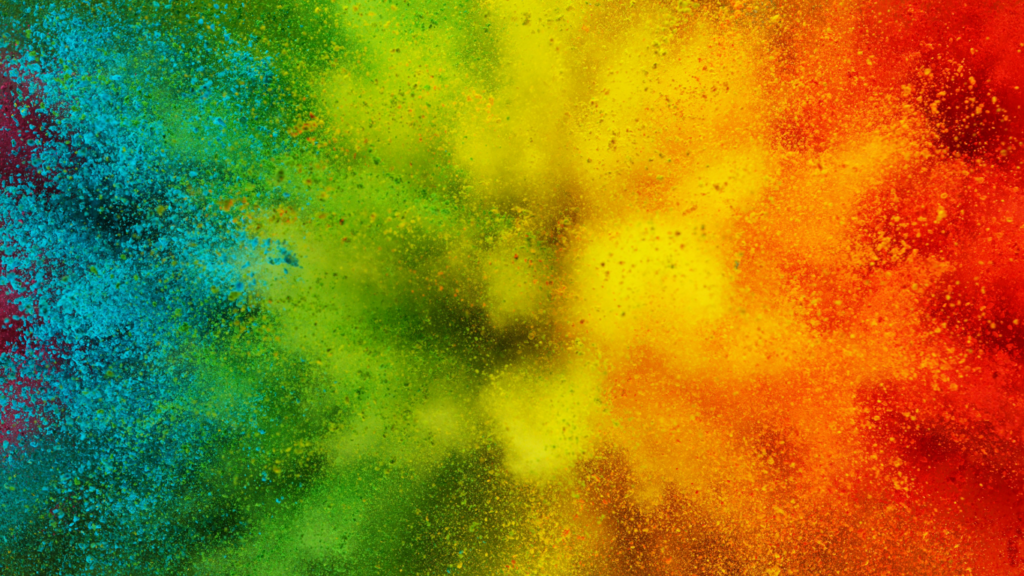
Each color tells a different story. Here’s how some of the most common brand colors impact consumer perception:
- Red → Bold, passionate, high-energy. Used to grab attention and create urgency (think Coca-Cola or Netflix).
- Blue → Trustworthy, calming, and professional. Often used in finance and tech (like Facebook and PayPal).
- Yellow → Optimistic, cheerful, and friendly. Works well for brands that want to radiate positivity (such as McDonald’s or Ikea).
- Green → Natural, fresh, and balanced. Commonly used by brands with an eco-friendly or health-conscious message (think Whole Foods or Animal Planet).
- Purple → Luxurious, creative, and wise. Associated with premium brands or those in beauty and wellness (like Hallmark or Cadbury).
- Orange → Playful, energetic, and adventurous. Great for brands that want to feel fun and approachable (such as Nickelodeon or Harley-Davidson).
- Black & White → Elegant, sophisticated, and timeless. Often used by luxury brands or minimalistic identities (like Chanel and Apple).
Cultural and Industry Considerations
While color psychology is powerful, it’s important to consider context. Colors don’t always have the same meaning everywhere. For example, while white symbolizes purity in Western cultures, it represents mourning in some Asian countries. Green is associated with wealth in the U.S. but signifies misfortune in some regions of South America.
Likewise, industries tend to have color trends. Banks often use blue to establish trust, while organic brands lean towards earthy greens. The key is to choose colors that not only resonate with your audience but also differentiate your brand from competitors.
How to Use Color Effectively in Your Brand
Choosing your brand’s color palette isn’t just about personal preference—it should be intentional. Here’s how to make the most of color psychology in your branding:
- Know Your Brand Personality → Define what you want your brand to feel like. Is it bold and high-energy? Calm and professional? Luxurious and exclusive? Your colors should reflect this.
- Understand Your Audience → What emotions do you want your customers to feel? Research their preferences and cultural associations with color.
- Find Your Industry Balance → Consider what colors your competitors use. Do you want to fit into the industry norm or stand out?
- Use Contrast Wisely → High-contrast colors make a brand more visually striking, while subtle tones create a softer, more refined look.
- Test and Refine → Use A/B testing on website elements, ads, or packaging to see how different colors influence engagement.
Final Thoughts
Your brand’s color palette is more than just a design choice—it’s a strategic decision that affects how customers perceive and interact with your brand. When used thoughtfully, color creates an emotional connection, strengthens brand recognition, and guides consumer behavior.
Whether you’re building a brand from scratch or refreshing your existing identity, take the time to choose colors that align with your message, industry, and audience. Because in the end, branding isn’t just about looking good—it’s about making people feel something.